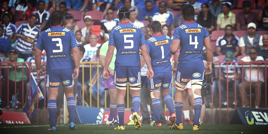
 From a garish rainbow to the famous blue and white hoops, the Stormers have been through a lot of change since the beginning of the SuperRugby era. Here’s why they wear their jersey so well, especially now that it’s got a BrightRock logo on the back.
It seems crazy to think that rugby union has only really been ‘professional’ for a shade over 20 years.
The change from the amateur to professional era saw SuperRugby come into its own as a sporting tournament, and since the late 90s it has been an icon of modern rugby, with enough glitz, glamour and live action to make the northern hemisphere blush.
SuperRugby has seen many changes over the years. One thing that has always caught my eye has been the Stormers jersey.
 Before 1998, the Cape based team in SuperRugby was still Western Province. When the franchise system came into being for the South African sides, the ‘Western Stormers’ were born.
Made up of Western Province, South West Districts and Boland, they wore a jersey designed to represent all the unions (pictured). It looked like a very odd ‘rainbow’, made up of swathes of blue, white, red, green and gold, topped off by a triangular logo with a wave illustrating the ‘storm’.
Thankfully that jersey lasted just one season, and a pretty forgettable season it was. The ‘Western Stormers’ then made a bold change by becoming ‘The Stormers’ and going all black for the 1999 season.
The logo went from that triangular wave into the lightning bolt we have today. A big improvement from the technicolour dream jersey of the year before.
 The all black jersey (pictured) was intended to appeal to a wider audience, and certainly gave the Stormers an identity they could build on. They became a force to be reckoned with after a shaky start in the earlier years of the tournament.
In 2007 they made another change, from all black to navy blue, bringing them more in line with the traditional colour of the Western Province union.
With the change of colour, they went even further back to the roots of the union in 2011. The Stormers jersey incorporated white bars across the front, representing the blue and white hoops of the traditional Western Province jersey.
Fans were happy with the more traditional look. With Western Province winning the Currie Cup in 2013, for the first time since 2001, it was time for another change, with royal blue brought in to replicate the original Western Province jersey.
Good thing too, as the iconic image of players running rampant in the blue and white hoops is always a wonderful sight for the fans. Go, Stormers!


Leave a Reply